
 Context and Color: How to Read Maps Rhetorically
by Jordan Pierce
Context: it’s everything. Whether reading a map on a road trip, watching the weather forecast, or analyzing regions for a geography exam, context creates the perspective that allows a reader to correctly (or incorrectly) decipher a map’s true messages (Pierce). Depending on the context, visual aspects of maps might become confusing or difficult to interpret. If, for example, the colors on a map are confusing or overwhelming, the map can feel disorienting. Mark Monmonier, the author of How to Lie with Maps, writes that “many otherwise educated people are graphically and cartographically illiterate” (3), suggesting that the general public needs some advice on how to properly read the sometimes confusing and even misleading qualities of maps. I argue that, by reading characteristics such as color and genre rhetorically, readers can more accurately interpret a genre of our everyday lives: maps.
Contextually, we expect maps to be “accurate.” J.B. Harley’s “Deconstructing the Map” states that “The object of mapping is to produce a ‘correct’ relational model of the terrain” (277). But, even Harley’s scientific mind would have to acknowledge that features like color and generalization are some of the important components of map creation that mix to form the public perception of a map. Color, in Monmonier’s text, is a word that encompasses both the hue itself and all the emotional and social connotations a color might carry with it (163). Generalization, in this same perspective, refers to a mapmaker’s decision to distort and disregard the actual reality of an area for the sake of portraying a desired aspect of this reality (25). A professional mapmaker often purposefully allows for generalization and consciously uses colors in order to communicate his or her desired message. As Mark Monmonier states, “The map is how it is because the map author ‘knows’ how it should look” (42). Mapmakers, like artists, carefully choose what to include and what to leave out of a map. Normally, these visual combinations mesh and work beautifully together. Sometimes, however, if the mapmaker uses too many or too few colors/generalizations or uses the wrong colors/generalizations, the map suffers and fails to effectively communicate its intended message. Reading it may even become misleading, confusing, and alarming.
According to J.B. Harley, “All maps strive to frame their message in the context of an audience […] and they are propositional in nature” (285). It is time to put our eyes to the test: the following maps illustrate the advantages and disadvantages that accompany the use of color and generalization in maps and how these ingredients can affect the reception of each map’s visual proposition.
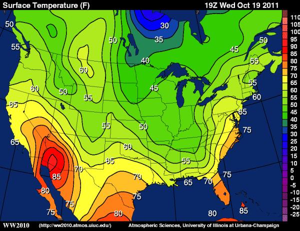
Figure 1: Weather World Editors
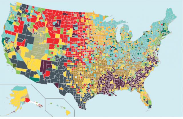
Figure 2: Column Five Media and Daryle Maciocha
Color Connotations
The first characteristic a reader of these maps might notice is the vivid use of color. In the maps above, color is an integral visual feature by which a viewer can interpret these images. The use and function of color in each map, however, is extremely different. The top map (figure 1), as you may be able to discern on first glance, depicts the surface temperature of greater North America, while the second map (figure 2) has no direct signs pointing to what it is describing.
Monmonier explains how colors used in maps like the figure 1 surface temperature map “benefit from contrasting hues, provided that somewhat similar hues represent somewhat similar features and radically different hues represent radically different features” (167). In this respect, the surface temperature map creates a vivid representation of climate. Vibrant reds and oranges are “warm” colors and the deep blues and darker greens are “cool” colors. Using logic learned in elementary school art class, it only makes sense that the reds and oranges represent the areas of North America that feel much hotter than other regions. Conversely, the deep blue and dark green spots are much colder than anywhere else on the map (Pierce). Figure 1 is an example of an effective use of color divisions to create “quantitative classification,” a technical term for dividing a map into different regions based on some numerical quality (Stern et al. 15). This temperature map uses color in a fashion that appeals to people’s common sense about color meanings and fits the context of the map.
Figure 2, however, displays a much less intuitive use of color. In fact, based on what connotations specific colors have in American culture, some viewers (like me) might instinctually feel a pang of fear and concern for any citizens who might be living in the areas that are painted bright red. After all, Monmonier reminds us that red is associated with “fire, warning, heat, blood, [and] anger” (170). Especially after seeing the clear use of color in the surface temperature map, a reader might expect to see that the areas of red on figure 2 represent some sort of intense, possibly dangerous force. Figure 2 is an example of an ineffective use of “qualitative classification,” which is “the identification of geographic regions” by specific characteristics, since the confusing nature of the colors in this figure does not effectively describe the characteristics that are shown (Stern et al. 15). Let us now discount first impressions and take a look at the table below to see the actual meaning of color on this map.

Figure 2.5: Column Five Media and Daryle Maciocha
The people in the red counties are not dying of hunger or enduring anything else morbid and horrifying; they are simply members of communities predominantly supported by the farming industry. Red has nothing to do with intensity or danger in this map; it is merely the color the mapmaker chose to represent agricultural areas (Pierce). In the same way, green and blue do not mean anything in particular on this map; they just represent other socioeconomic regions of the United States. Color, Harley writes, is one of the “casual metaphors” of maps (283). The way people read into color when looking at maps is a testament to this statement.
Both maps above are “choropleth” maps, or maps that measure a statistical set of data using color shading or patterns. So why is one map naturally easier to read than the other? Well, the fraudulent first impression figure 2 gives is caused by one major difference in the two maps: while figure 1 portrays temperature using colors in a manner that is instinctual to readers, figure 2 is a choropleth map that seemingly disregards the common connotations of certain colors. How to Lie with Maps warns readers to “Be suspicious […] when contrasting hues attempt to show differences of intensity on choropleth maps” (165). Because of the statistical nature of these types of maps, readers’ intuitive understanding of what certain colors mean can hinder the communication of the mapmaker’s message. For some maps (like figure 2), it is even necessary that the author of the map create a table like the one in figure 2.5 so the reader can successfully interpret the map in its correct context.
Subtle Generalizations
While color usage is the first characteristic of maps that actively jumps out at the reader, other important aspects are more subtle, such as generalizations. Boris Stern, in Generalisation of Map Data, states that, “How well your map will be generalized depends on your experience in cartography … but also on your artistic sensitivity for the map balance, colours, … or disposition of the map” (25). Thus, it is only fitting to ask, how does the mapmaker use artistic ability to effectively communicate the map’s purpose? And what must a reader infer or deduce from the subtle details in a map’s generalizations?
Generalizations can even be misleading, but such deliberate misrepresentations are necessary flaws in all maps – yes, deliberate and necessary. Monmonier admits this possibly startling fact: “A good map tells a multitude of little white lies; it suppresses truth to help the user see what needs to be seen” (25). The makers of the two maps in figures 1 and 2 have taken this liberty to distort reality so their readers can more clearly understand the maps. This may be a jarring reality to accept at first, but the negative connotations of lying with maps fade when one truly takes time to examine how these purposeful omissions positively affect how people interpret maps.

Figure 1a: Weather World Editors
In figure 1a, a close-up of a section of figure 1, for example, one generalization is clear at first glance: the temperature regions on the map are differentiated by colors that represent specific increments of five degrees Fahrenheit. The separate color regions outlined in black on the map show this. Thus, the map is generalizing all temperatures that fall between, say, 60-65 degrees, as one region.
If the mapmaker made a color for every five-degree increment, why not just have a color for every degree? Before we abruptly label this mapmaker as lazy and careless, consider this: If the mapmaker wanted to make a color for every degree, he or she would not only have to recreate a much more complicated scale on the right hand side of the image but would also need to generate a multitude of region-separating curves (the black lines separating one temperature color from another in figure 1 and figure 1a) on the map itself. This might make the map so visually exhausting that its purpose of communicating North America’s temperature would fail to come across clearly.

Figure 2a: Column Five Media and Daryle Maciocha
In figure 2a, an even closer image of figure 1, the mapmaker is generalizing the socioeconomic makeup of every county in the United States. Contrary to Monmonier’s statement about map generalizations, Harley emphasizes the other side of the argument. Some generalizations, like drawing a straight line for the border of a state or using a drab tan color for all the land on an atlas, promote “the sly rhetoric of neutrality” (Harley 289); this can be helpful in eliminating extraneous information that would not support the map’s clarity, but it can also persuade us into believing a misconception about a certain area. Take figure 2a, for example. As a reader, I am inclined to visualize North Dakota and Montana as areas with no cities, full of livestock, and inhabited by people who reside in rustic farmhouses on luscious, green pastures. Even though my mind invokes this image, I know that it cannot be completely accurate. After all, my home county of Carter County, Oklahoma is shown as an “Evangelical Epicenter” according to the map legend. People who have never been to my home county might imagine a plethora of quaint towns littered with churches, inspirational bookstores, and other religious institutions. I can say from personal experience that, within my home county, this generalization is sometimes true for a few of the smaller towns. In my own hometown, however, and in many of the surrounding areas, healthcare and business industries are booming; honestly, I see my hometown as more of what the mapmakers would define as a “Boom Town” type of city. But I understand that the mapmaker needed to generalize the region in order to “reflect a chosen aspect of reality,” as Monmonier would put it (25), and, therefore, I am accepting of the slight alteration to the accuracy of this map. In this case, mapmakers chose to reflect an overall sense of the socioeconomic essence of each county while sacrificing the identity of individual towns within each county. They decided that using visual rhetoric to generalize entire counties, which is a form of what the cartographers who wrote Generalisation of Map Data call “selective omission” (Stern et al. 11), was the simplest (and therefore, the best) method for their map.
Visual Test: COMPLETE
A meticulously constructed map contains its share of advantages and flaws. More often than not, such a map is clear and highly informative, even though the reader might have to do some explorative testing in order to understand how the visual elements work together. There might also be something (or many somethings) omitted or seemingly overlooked in any map, but that might actually be preferable. For a map to be comprehensible rather than simply a colorful or even artistic visual, an author must ponder many questions: Do the colors work well together? What needs to be added or subtracted to the map? Most importantly, the mapmaker must ask if enough has been done to correctly create appropriate context for the information so that it fulfills its purpose for readers.
Works Cited
Figure 1, 1a, and 2a. Weather World Editors. Surface Temperature from Wednesday, October 19, 2011. Map. University of Illinois. 19 Oct. 2011. Web. 4 Apr. 2012.
Figure 2 and 2.5. Column Five Media and Daryle Maciocha. “The 12 States of America.” Map and chart. The Atlantic. 8 Mar. 2011. Web. 4 Apr. 2012.
Harley, J.B. “Deconstructing the Map.” Classics in Cartography: Reflections on Influential Articles from Cartographica. Ed. Martin Dodge. Hoboken, NJ: John Wiley & Sons, 2010. 273-294. Print.
Monmonier, Mark. How to Lie with Maps. Chicago: The University of Chicago Press, 1996. Print.
Pierce, Jordan. “A Contextual Juxtaposition.” PicturesWeSpeak. WordPress.com. Blog. Jan-Apr 2012. Web. 8 Apr. 2012
Stern, Boris, Lorenz Hurni, Marion Werner, and Samuel Wiesmann. “Generalisation of Map Data.” Geographic Information Technology Training Alliance. (2014): 1-28. Web. PDF file.
—
Jordan Pierce is a native of Ardmore, OK, and is currently a Cell and Molecular Biology Major at Oklahoma City University pursuing an eventual career in dentistry. He enjoys conversing and writing using metaphors and parallelisms, which make the world easier for him to understand; he used these techniques heavily in creating his argument in this essay. Writing is his escape from his major, where he has to re-memorize the Kreb’s Cycle and learn the main biochemical functional groups. Anton Chekhov once said, “Medicine is my lawful wife, and literature is my mistress. When I get fed up with one, I spend the night with the other.” Jordan agrees with this metaphor since his life fits a similar balance. He would like to thank his readers for giving him an excuse to continue his affair with writing.

You must be logged in to post a comment.