
Digital Possibilities: Project Artist Statement
Click this link to view project
by Oliver Moody
Stills of project:


Introduction & Influences
In English 221 at the University of Michigan, we learned about map-making processes and developed a deeper comprehension of the ArcGIS software through a Personal Geography project, which then fed into our current Digital Possibilities project I’m writing about today. I established the original idea for my Digital Possibilities project immediately after receiving the assignment prompt since I had previously considered pursuing the very same concept in our Personal Geography project. In the past project, I decided to direct my map towards my personal and professional focuses in life, centering the map around specific sports venues. However, in this Digital Possibilities project, I have chosen to take an even more personal route while also showcasing a more nuanced understanding of how to use the ArcGIS software.
I developed the idea for my map based off two interactive maps I had previously discovered online for the Adirondack Park in upstate New York. As a child growing up, my parents sent me to camp for four weeks each summer in Willsboro, New York, whereI became accustomed to the Adirondack High Peaks, otherwise known as the “46ers,” due to the number of mountains in the region over 4,000 feet in elevation. It took me ten years to complete all forty-six mountains, from my very first summer as a camper, when I climbed “Big Slide,” to my last summer as a counselor ,when I climbed “Cascade” with my twin brother Sebastian. Becoming a “46er” is one the greatest memories of my life, and, ultimately, when approaching this map, I conceptualized a way to give back to the 46er community that had already provided me with so much.
Online maps of the Adirondack Park already exist, a useful interactive trail map that highlights the necessary trails for each respective mountain being climbed. There is another Google Earth-style map as well. In my map, I am looking to combine aspects from both of these examples to ultimately function together as a more creative space within the Adirondack “46er” community. As I will mention later, I did not accomplish the original design of my Digital Possibilities project, but, in essence, my project was deeply inspired by the notion that this map could be a collaborative space for climbers of the 46, like me. During my meeting with the University of Michigan’s ESRI-Support member Nicole Scholtz at the Hatcher Graduate Library, I was able to select the design style, after she provided numerous suggestions. We looked through several options, and, ultimately, a “Marstel-Day: Earth Map 2015” influenced me to follow the accordion design in my presentation-creation process.
Design
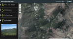
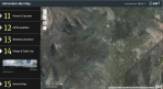
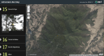
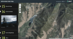
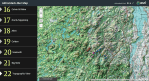
For my presentation in Story Maps, I chose to follow the accordion-style template since it can quickly transport the focus onto another region of the map at the click of a button. The original concept was to create an interactive map where audiences could collect images, video, and other forms of media through a real-world (using real imagery) mapping space that lays out all 46 peaks accordingly. Initially, I was hoping to create a platform that allows participants to add and contribute their own visual and multimodal content as well. Unfortunately, I was not able to find a solution in ArcGIS to enable this desired function. The final design of my map starts with a full-scale view of the Adirondack Park with each mountain highlighted on the plane by a colored plot point. Most of the mountains in the park have an accompanying range (three or more mountains) or pair (two mountains), in which I have defined separate color groups to visually represent this. Single mountain groups (one mountain) have their own distinct color, but there are only four examples of these present in my project.
Additionally, I created tabs for each one of these color-coded collections on the left-hand side of the map, equipping the map with the capability to quickly transport its audience to a zoomed-in perspective of each one of these mountain “groups” on the actual map. The reason why I arranged these sets of mountains together is that most hikers regularly hike these mountain clusters together. Ultimately, my intentions were to categorize the mountains together based on their location and associations with each other within the 46er community. These color-coded groups are a design feature primarily fashioned for my desired audience. The final design allows for participants to easily find each mountain in the forty-six and find associated images and information provided by myself and the Adirondack 46er website.
Content
For my visual and auditory content, I chose to include the multimodal components as an introductory segment because all of the content provided in the rest of the map stems from my past. I have collected a great number of photos over the years hiking in the very same state park, so I was very pleased to finally put my stored content to good use. For the video, I introduce the map itself, explaining its purpose and significance to my life. Secondly, for audio, I provide a type of mini-tutorial where I briefly walk through the functions of the map. In summary, I designed these multimodal components to assist audiences in understanding the raw purpose of my project in a fast, simple manner.
My biggest dilemma during this project came when I attempted to implement additional visuals as add-on content in my presentation, but ArcGIS limited me to one image for each plot point and one image for each Story Maps tab. When I looked online for assistance, most websites said that the only solution was to create composites (multiple photos in one file like a collage) or to go back to the Excel sheet and update the tabs to allow for more image links. Ultimately, the technology fronted various issues for me during the project creation process, and since I was already dealing with over 90 different images in this project, I decided that it would be far too time-consuming to implement even more images into my Excel sheet, one by one.
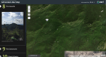
In turn, I ended up selecting representative photos of each mountain/group as a result, trying to provide the best content for the area as possible. This included “Summit Signs” (the physical signs sighted on top of each mountains), views/pictures from the mountain’s summit as well as pictures of a specific mountain summit from a distant viewpoint (such as from another mountain). Additionally, I included some of my favorite panorama photographs taken more recently with my iPhone. The goal of these photos is to give audiences an idea of my adventures amongst these mountains while also showing the park’s grand nature and size. As for the descriptions, I came up with the writing but received all the necessary statistics, numbers, and significant facts from the Adirondack 46er website. It was very important that I got my information from this site, specifically, since it is the organization that oversees the community I wanted to extend this map towards.
Audience & Purpose
My map’s message is that the 46ers exist relatively close to much of the Eastern United States, yet most people that I know have never even heard of them. As of right now around 12,000 people have climbed all forty-six mountains maintaining a very small but strong community of like-minded mountain climbers. I chose to implement images into this project because they serve as visual evidence of my visits to each of these mountain locations. Ultimately, these photos are the context in which I’m presenting my knowledge of this area. For the most part, the audience only perceives an aerial view. Although my original intentions were overly ambitious and meant to serve the 46er community, I do find some more gratitude in repurposing the project to inform my social community of the mountain range I have grown to love and appreciate.
I initially chose my audience for this map to be the 46er community because I wanted a collaborative mapping application capable of allowing viewers to share their own photos with each other via the website, but, unfortunately, that goal was a tad over-ambitious. That function does not yet exist in ArcGIS, so in turn I decided to broaden my audience to my personal friends, family, and peers on Facebook and Twitter. These “followers” and “friends” are comprised of people that know me personally and likely understand my connection to these mountains. This map will serve to inform them of my adventures in this area but also provide some more contextual knowledge into what the “46” mountains are, what qualifies them as this type of “46er,” and showcase visual representations of what you might find on each summit. My personal background deeply affects this map’s overall objective and all of its content as I have used only personal images in the project taken by me or my family over the past 12 years. My personal background enables these images for the map but also inspired me to create a project based on a personal accomplishment I pursued years ago.
—
Oliver Moody created this digital map of the Adirondack Park High Peaks in Upstate New York for an English course at the University of Michigan.

You must be logged in to post a comment.